The Design of Millennium Maximus, and Its Core Fantasy
1. Table Of Contents
- Table Of Contents - You are here!
- Introduction - Brief overview of Millennium Maximus, and the contents of this post-mortem
- Game Jam Timeline - Cool pie chart showing how I spent my time making this game in a weekend
- Design Considerations - Why did I do the things I did?
- Overall
- Dueling
- Island Management
- Narrative and the Core Fantasy
- Cutting Room Floor
- Nitty-Gritty - Implementation - How did I do these things?
- Card Design
- Island Management
- Dialogue System
- Bringing them together
- Continued Development - The future of the Millennium Maximus extended universe
- If You Like This, Check Out - Some recommendations for cool PICO-8 and parody stuff
2. Introduction
"In Millennium Maximus, you are the creator of a childrens' card game! Design and release cards to keep your fans excited while thwarting spiky-haired protagonists!"
Mechanically, Millennium Maximus is a hybrid management-narrative-card game, with a strong emphasis on theming and humor. That's a lot going on, so I wanted to talk about the design and ideas that went into it. You don't need to have played MM to understand; I give a lot of context for everything and all the systems. But, I still recommend you do because I think it's pretty cool. You also don't need to have a solid understanding of code or jargon either! I wanted this to be accessible.
I wanted to write about this for a few reasons. There’s a lot going on, and I wanted to talk about how it works. It is pretty big scope for a solo game jam, and I wanted to talk about how I got it done in time. And I wasn’t sure if I wanted to work on this more, and thought talking about it would help me decide.
This also turned out to be a pretty long write-up! I'm not used to writing things like this, but I wanted to organize sections so people would read what they're most interested in. I hope I did well.

3. Game Jam Timeline
I think this is worth going into here because MM is an ambitious project for a game jam - it has three hugely different game states plus a dialogue system with an in-depth story. That's a whole lot going on to make in the 72 hours of mini jam, and I'm proud that I managed it. I attribute this to two factors, primarily:
First, the game was already largely thought-out before-hand. I've been sitting on this idea for a while, and I had a pretty clear vision for the structure and birds-eye design of the game. This meant I could speed along into implementation from the start, and keep up a good pace for most of the whole time - I just had to create things, instead of coming up with ideas and then creating them.
Second, PICO-8 is an incredible tool for rapid development. I don't think I'd have a chance to finish this if I had used Unity. There are so many reasons for this, big and small: Everything is integrated into one environment - no need to create sprite assets, then import them to unity, then add them to game objects. No need to switch between a code editor to the unity window to the hierarchy. Everything is also code - once you have the assets, you can easily draw them with spr(). And you don't have to wait for it to recompile every single time you make any small change. And I could go on....
With all that out of the way, a quick rundown of the development of different systems and some thoughts on them. These numbers are mostly approximate - some of them I know are pretty exactly right, like day job and card design, but I tried to account for all 72 hours of the jam.
- Card Design state: 4 hours
- Island management state: 6 hours
- Dueling state: 10 hours
- Dialogue system: 3 hours
- Narrative dialogue: 5 hours
- Other design: 4 hours
- Other misc (sprites, music): 4 hours
- Leisure (board games, youtube): 8 hours
- Sleep: 20 hours
- Day job: 8 hours
I am a big advocate for sustainable development! I made sure I got plenty of sleep, as well as made time for a weekly online game night with friends. I made my plans around this, and my experience was better for it! This is especially important for longer-term projects.
4. Design Considerations
A) Overall
Every design decision I made mostly comes down to trying to make things as simple and as minimal as possible. Since this was just a game jam game and it had so many parts, I couldn’t put too much time into any one of them. The systems just needed to be compelling enough to hold someone's interest for roughly the half-hour playtime.
This is how I came to decide the properties for cards: Each card has a strength, element, and allegiance. They also have art and names, but those don't have any mechanical effects, These properties are diverse enough to differentiate cards and give them flavor. They're simple enough to keep track of them all. And crucially, it's just interesting enough to build other systems around.
These other systems are the management and dueling systems. The core design of creating cards is the conundrum "I have these two systems that are fighting for attention, and I can only do one thing for both of them." This is a kind of core I've seen a lot in board games, and it's very effective when it's done well. I don't think I did as well as I could with this, though: The management system doesn't take strength into account, which is a missed opportunity, and the "element advantage system" in duels is.... well, let's go there next.
In the end I wanted a game that still had multiple appeals. Some people, like me, are really into the story, but other people may just be interested in creating cards, other people may really like the management aspect specifically. I wanted all of these different parts to be compelling enough to be a draw for someone into it, while being simple enough for people who were interested in other sections. A good example of that here is with the card drawing: You have the full capability to draw your own art for your cards, and some people could be super creative and into designing their own cards. But, others may not. And I wanted to give those people prefab card art, so they could still have the interesting task of naming and giving stats to a card based on its looks.
B) Dueling
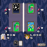
The duel system works as "play two cards, bigger number wins." There are two sub-systems here that let you put a bit more thought into it: Shared allegiance and elemental advantage. The idea here is a puzzle where you try to maximize your score: Is it worth playing a weaker card if it gives you some other bonus? It's a pretty light puzzle, but it's only one-third of the game, so it's enough. However, there's also not as much thought to this as I'm letting on: In Maximus's elemental advantage system, fire beats everything, and water loses to everything.
I think this is a hilarious joke, and a great subversion of expectations! However, it reduces the complexity of the dueling to "just play two high-power fire cards." This means that not only is the dueling system less, interesting, but it means once you make 2 strong fire cards, you don't really need to care about making cards with dueling in mind at all, which makes the card creation system weaker as well.
It's worth mentioning here, this game is strongly a comedic game. I wanted to work mechanical jokes like this one in with some of the systems. Sometimes jokes like this reduce the complexity of systems in a negative way, and one aspect is trying to strike a balance between fun and interesting versus simple and funny. I think in this case it's not a huge issue, since there's only three duels, but if it were a longer experience I'd have to address this.
I also made the decision that all the cards you make you have access to during the duel. If you look at almost any card game, you almost always are constructing a deck to use in duels, but funny enough Millennium Maximus isn't a card game, despite its strong focus on cards. It would slow down the experience and add unnecessary complexity; it wouldn't fit with the rest of the game. Also, it would be too much work to actually implement this kind of system. Remember, the core design is trying to make everything as simple as possible.
There are two ways in which the duels progress, over time: First, is the AI. The first two opponents just play the lowest-strength cards available, the last one plays the highest-strength cards. The final duel is demonstrably harder than your first because it picks bigger numbers. (If your biggest numbers also happen to be fire cards, then this leads to a stalemate). Second, the duels become more complex because you have more cards available, and thus a wider decision space. (At least, in theory - the decision space is shrunk by "fire beats everything").
"Adding more things to choose from" is a great way to accomplish progression because it's so natural. However, this isn't infinitely extendable. At the last duel, you have 8 cards to choose from. If the game were twice as long, it would be 16, which could be manageable for players, but is pretty unwieldy. It couldn't really be any longer than that, without introducing something to remedy this.
Finally, the last important aspect is with telegraphing. If a player can't figure out what's going on, they won't enjoy themselves, so it needs to be really clear why things are happening. Even though three rules isn't that many, most people aren't used to keeping these kinds of rules in their head. They're still simple, but they are a bit arbitrary. I didn't want anyone to feel like they won or lost and weren't sure why. So, I did two things here: I made help text always available to give you all the rules, and I also did my best to telegraph why the values were changing from the different effects. The GIF shows this off pretty well.
C) Island Management
The island management uses the same challenge I brought up earlier, but magnified: The islands all have an element they love, and an allegiance they hate, and you're trying to make cards to satisfy them and keep them excited. By keeping them excited, you earn more money, which you can use to unlock new islands, to make even more money. And that's basically all it has going on.
Unlike with the elemental allegiance, there's no glaring issues with this system. It's simple, but interesting. Nothing revolutionary, but it's a solid puzzle to keep players engaged. There are two weaknesses of this system, though. I already mentioned that it was a missed opportunity that the strength of cards doesn't come into play here. Second is that the islands aren't really differentiated between each other that much. Both of these issues could be solved, without introducing much more complexity, by making islands have more varied likes and dislikes: Maybe one island loves this allegiance but hates high-power cards, or even has more than one hate!
The island management's progression is pretty formulaic: You use your money to unlock new islands, which makes you more money, but also means you have more to keep track of when you make new cards. I think this is enough of a carrot-on-a-stick for this as a half-hour game jam, but I think it'd need a bit more bite in a longer experience. It's not that obvious as to what this would be, but I think I'd want the islands to be able to more dynamically react to the cards you create.
I also had lots of telegraphing considerations here! I talk about this in the implementation section, but I had the same philosophy of "keep information visible as desired, and use effects to show when things are happening."
D) Narrative and The Core Fantasy
After I finished work on the game, I came up with a pitch I liked to promote this game: "In Millennium Maximus, you are the creator of a children's card game! Design and release cards to keep your fans excited while thwarting spiky-haired protagonists!" In this, I make two promises: You make cards, and you duel with them. But, it's clearly tongue-in-cheek about this. It's a very silly game, after all. This tone indicates that it's closer in spirit to the Yugioh anime than the card game. Some games have power fantasies, this one is a Maximillian Pegasus fantasy.
In line with this fantasy, is the mechanical design of the game. The card design, management, and dueling are all pretty simple mechanically. This is because, one, it's already ambitious to have that much in a game and finish in time, but two, because these systems are all in service to this fantasy. Designing cards and making tons of money is all about making you feel like your character, an uber-rich game designer. The management mode tries to build out a world that is obsessed with card games. And duels introduce you to a colorful cast of characters who you interact with, before defeating and stealing their souls. That is to say, it’s not a management game, it's not a dueling game, but a narrative-driven game with management and dueling elements.
To clarify, I want the management and duels to still be compelling, since it’s really the core gameplay loop. I want it to be appealing enough for people to enjoy without paying attention to the story! But, to me the story is the most important part of the game. This presents a challenge to me, because I don’t consider myself a writer, and I don’t know much about storytelling.
Instead of worrying about telling “a good story”, my main focus here was just to tell as many jokes as I could, and run with it as far as I could. Again, this is something that is fine for a short experience, but a good story would be more important in a longer game. The humor is a huge part of it - I tried to have several mechanical ones, such as "fire beats all elements", and visual ones, like how islands use the poggers face when they're excited. Designing for humor is an interesting topic in and of itself - but I don’t know enough about that to discuss it much.
My favorite moment in the game, and I think the best fulfillment of my "Maximillian Pegasus fantasy" promise, is after the first duel, and you proceed to steal Nugi Johto's soul. This is what I mean, when I say everything is in service of the narrative: Mechanically, you're just going from a duel, to dialogue, to card design. But, when you consider what you're doing in-universe: You're defeating a challenger, and turning him into a card, which you'll then distribute world wide for your own profit. But it doesn't say any of that, you just get a transition to the next section with Nugi's face plastered on a card.
E) The Cutting Room Floor
So, what didn't make it in? Well, my vision was a lot grander in its narrative scope. I wanted more characters, but I barely had time to write dialogue for the 4 that you meet. This may be for the best, anyway, because I think the roughly 30 minute runtime is a real good spot to be in. I wanted more reactivity, like referencing your card names, but it just wasn't crucial enough to put time into so late. The biggest concession I had to make was related to world building: I had to minimize the "event" system I wanted, and I had to entirely drop a "news" section I had envisioned.
In the current version, there's a few world events that happen after your duels. First, an earthquake sinks an island, and then mount volcano erupts. This was meant to connect the dots between your actions as Maximus affecting the destabilization of the world. But, I don't think that really comes across. I wanted this system to be more fleshed out, by having more events (new islands coming and more significant changes) and by reacting to your actions (making a fire card would unleash fires, etc). I had a lot of trouble figuring out how to convey these ideas, and ultimately just cut them down to the two I had time for, and just basically went "hey, these things are happening."
The big cut section was a "news" segment, which would have happened after island management. The purpose would be to expand the world a bit more. This is where a lot of the cut reactivity would have been - there'd be headlines such as "Fairboat Island bans <card name> for degeneracy", "Pro Player Johto speaks out: Not enough water cards to compete at a high level." It also would have had a bunch of gags to better paint the world as being obsessed with your creation - "Mount Volcano's GDP crumbles after thousands of rare cards burn in volcanic vault" and "Doctors hate him: Man treats incurable disease with <card name>." I realized during the second night that there was nowhere near enough time for this.
5. Nitty-Gritty - Implementation
A) Card Design
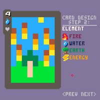
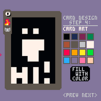
First, the card design section: This one had to be done first, because it's kind of the core of the game, but I also wanted it to be first because it was the most interesting to me. Code-wise, this system is pretty straightforward: I have a table of cards, which each is just a bunch of data (Power, element, name, etc). And there are a bunch of buttons on-screen that let you change this data, which is reflected in real time.
The coolest part is the ability to actually draw them out - a feature that really helps you feel like you're creating them, despite it having no actual effect whatsoever. This was actually super easy to do, in PICO-8: Each card is just allocated a section of the sprite sheet, and you are just modifying the sprite sheet with a function called sset - I just need to do a little math to correlate the mouse position to the sprite sheet. I'd have no idea how to do this in Unity. And PICO's limitations actually supplement this really well too! The low-rez cards not only fit right in, but it also turns the drawing into a simpler process for players too!
B) Island Management
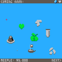
The island management section has a bit more going on. Based on the cards you make, islands will be more or less excited for the new set. And they'll give you more money based on how excited they are. Plus, there's a bit of progression, where you can use your money to reach new islands. Again, mechanically it's simple, but the trouble here is telegraphing this information to the player. If you've seen me talk about game jam games (check out my Twitch where I'll sporadically play games from major game jams) you'll have heard me say that telegraphing is one of the most important aspects of games: If a player can't figure out what's going on, they won't enjoy themselves. So, there are two things I do to convey this, which are hover-behavior and particles.
I'll talk about hovering first: I used buttons all over the place in this game. The "next" selection is a button, the islands are all buttons, even the cards in the duels are buttons. All a "button" is, is a table (everything in lua is a table), with "draw" and "hover" and "click" methods. This is a pattern I learned from 2DArray, which is super helpful for mouse-intensive PICO games, since you can just define their behavior and iterate through a loop to draw them all and handle input. And it's an interface that most everyone already understands because they already use computers all day! The relevant part here, is that the islands' hover method lets you know what the island does and doesn't like, as well as how excited they are.
Second is particles! I'm a fan of the mantra that you can never have too many particles. This particle system I lifted pretty much exactly from my previous game, Pushamo. I really like this particle system because it's super flexible, though I can't speak to token count and optimization. Each particle is a table that holds a method, and two of its own tables. One sub-table is passed as the parameters to the method, the second is used to change the first table over time. For example, {spr, {6, 63 ,63}, {nil, 1, 0}} will draw sprite 6 at the coordinate (63,63), and move right by one pixel every frame. It also allows code to be executed after a particle is destroyed, which allows me to chain them together. Here, I use particles to show when you earn or spend money, when you ship cards to islands, and how the islands feel about their cards.
C) Dialogue System
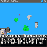
The dialogue system is very straightforward: Each instance of dialogue is a table, holding one or more individual lines. Each line has data for the character speaking (name and picture) as well as the actual line of dialogue, which is printed without change. This means that it doesn't try to do any smart line break stuff; instead I had to enter in the line breaks myself.\nFor every single line of dialogue. If you played an early version, you'll have noticed a couple of mistakes towards the end when I started feeling rushed - this bare-bones system gives you more control, but is prone to mishaps.
Later on, I added two new features which greatly improved the immersion: Each line can have a method, which is called to draw any background, allowing you to switch between scenes mid-dialogue. Each line can also have an optional integer, which would change the music track in the background, giving me control of the ambience as needed. There was a lot here I wanted to do but didn't get to - dialogue for fail states, referencing your own card names in text, word highlights. That's kind of how game jams are, though. You have to be prepared to cut things out.
D) Bringing them together!
So, all these systems are built, now all that's left is to bring them together! Since this version is completely linear, it's super straightforward: I have an appropriately named big event table. This table is kind of the mastermind that tells the game what to do next: Once a dialogue is complete, or a "next" button is pressed, it consults this table for what to do next. Every element is a function, so it just keeps track of an index and calls the next one.
Most of the functions here are generic and used several times. But, I wanted to have more variation, and have some world-altering events occur. So, later on, there are a couple events that will only ever happen once and have huge changes! These are things like islands sinking or volcano erupting. This system allows for that, but because it's all in one list, it would become unwieldy if the game went on a lot longer. As well as making changes in the middle could have unintended repercussions, this kind of design is really useful for a prototype but kind of dangerous as well.
6. Continued Development?
I'm gonna spend a bit of time cleaning up some stuff and making things look nicer - without any significant changes - then yell into the void more. After that, I'd like to work on a bigger version, but I'm not ready to commit just yet. It turns out, making games is hard and I want a good plan before going forward.
This was essentially a proof of concept of an idea I've been sitting on for a bit. I wanted to see what it could look like if I tried bringing it to life, and I think it came out really well! I think it's a really cool idea that deserves to be taken further! However, there's a great many considerations to take into account.
- Size and scope: I want it to be big enough to flesh out a goofy world with absurd characters. But, I want it to be small enough that I can realistically finish in just months.
- Content: I consider myself a designer and programmer; I don't have much experience with art and writing. This game leans super heavily into both of those for the best experience.
- Core mechanics: I think lots of the mechanics are great for a short-runtime experience, but I'd want to make them a lot more compelling in a longer-form game.
- Core loop: The core loop also needs lots of tuning. The simple cycle of “make card, get money, read text and sometimes duel” won’t work as well in a longer experience, at least not in its current state.
- Engine limitations: This is a big one. I think it’ll be hard to reach the idea’s full potential in PICO-8. But, using PICO offers many benefits to me as a solo dev: It makes development more fun, it makes development faster, and it helps force the scope to be small. But, it really limits a lot of other design decisions, makes platform support really hard, and the PICO-8 text isn’t great for text heavy games.
- Profitability: I don't care about making money, and like with Pushamo I would put a price on it, with all the proceeds going to charity.
7. If You Like This, Check Out:
Cool PICO-8 Stuff
- Pushamo - Super satisfying arcade push-em-up that challenges you to organize different shapes into squares to clear blocks and earn points! It's got tons of variety through over a dozen wildly different modes that let it be frantic, relaxing, and even puzzling! And 100% of the sales are given to charity!
- How Fantasy Consoles Can Bring Out Your Very Best - Presentation at SIEGE where I talk about how the unique limitations of PICO-8 can help you make more creative work fast!
- Tweetcarts - Small animations generated by code that fits within the length of a tweet
- Gruber Music - Great resources for creating music in PICO-8 as well as several free tracks
Inspirations
- Millennium Blades - A massive board game, where you play a fictional ccg, buying, selling, and trading cards to build a deck to bring to a tournament. Several cards or "sets" are parodies of popular media, such as "Fantasy Finale" and "006+1" and "the Ultimate Steel Cook"
- Kardboard Kings - A video game about managing a card shop, and meeting a colorful cast of characters.
- Box Peek - A wonderful little short series about a little boy, Jordy Defective, who wants to be the best at the world-wide phenomenon called Box Peek. He meets two friends who tag along his journey. Target audience is 30+ year olds. Super charming papercraft animation.
- Actual Yugioh - Try as I might I can't out-cheese the actual series. There's a character who ran away from school and lived in the jungle for years to perfect the art of drawing the right card, a skill which he uses to steal lottery sandwiches. There's a character who was in a shipwreck, his only possession being his duel monsters, who helped protect him and build an escape raft. It's just not fair I have to go up against this.
Files
Get Millennium Maximus
Millennium Maximus
Design a children's card game and thwart spiky-haired protagonists
| Status | Released |
| Author | brook.p8 |
| Genre | Card Game |
| Tags | Management, Parody, PICO-8, Story Rich |
| Languages | English |
More posts
- Update 1.1 - Improved FontJun 18, 2021
Leave a comment
Log in with itch.io to leave a comment.